

it would be pretentious of me to talk about the clothes and accessories designed by martin maison margiela. first, im not a fashionista. second, i jus cant afford a four digit price for a shirt.
i admire avant agarde designs. i know its not that easy donning such outfits without looking silly. aside from a hefty wallet, one must have the right attitude and body structure to carry a look that spells fierce. otherwise, people will label u a weirdo...well, i have to remind myself that this is not a fashion blog, so i have to leave the design aspect to the fashion savvy people.
lets focus on their website instead: martin maison margiela
ive visited countles of websites but very few caputred my attention. heres one: http://www.maisonmartinmargiela.com/
its unique, simple and functional. most websites selling high end items usually have a sleek look with eye catching flash animations. margiela went the other way with an understated style and a concept that is a bit deceptive.
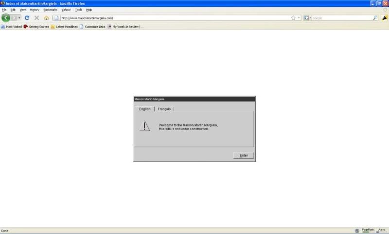
greetings! this dialogue box seems to tell you that an error has been encountered, but no its not! its a bit misleading if you dont read computer dialogues carefully.
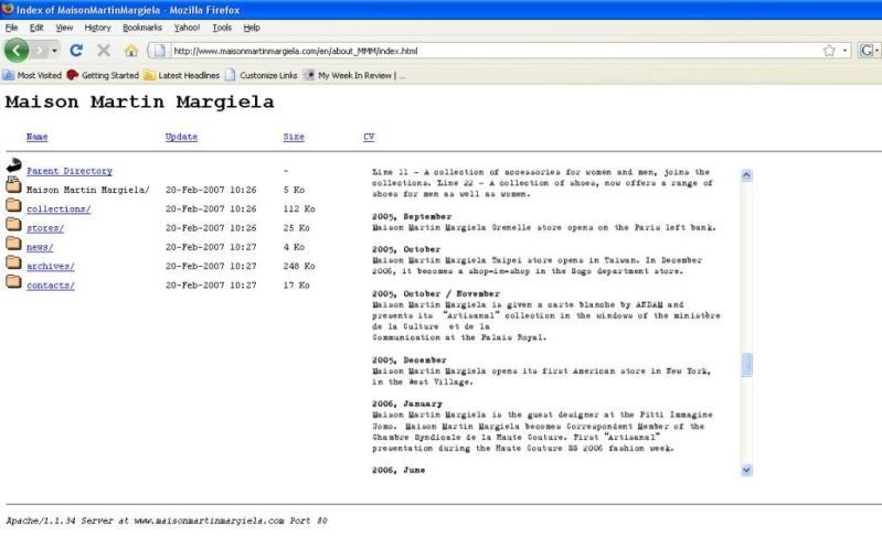
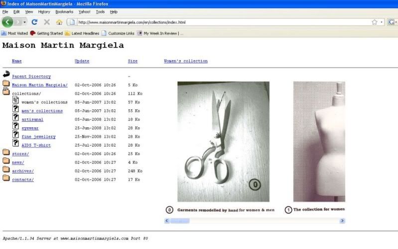
the lay out is simple. it is patterned after an index/parent directory site - just folders that drops down to show sub folders containing files. adopting this concept is a bit risky coz people might think they are in the wrong site. if u disregard the images, the site definitely looks empty, it looks like its under construction. it doesnt look like its showcasing beautiful things at all. but while navigating around the site, u realize that the this odd simplicity actually works. the statement is so evident. the website speaks for margiela's overall philosophy of being innovative, cutting edge, experimental, different and cool.
 nothing fussy. jus like the elusive margiela himself.
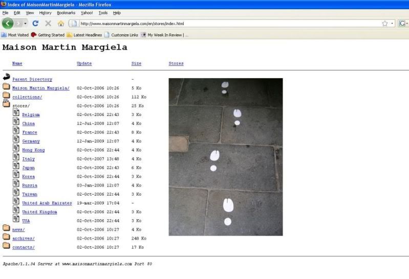
No comments:
Post a Comment